Tuesday, March 30, 2010

Amazing Interiors Design Collection from Brandon Barre

Amazing Interiors Design CollectionAmazing Interiors Design Collection
Amazing Interiors Design Collection
Amazing Interiors Design CollectionAmazing Interiors Design Collection

Complex Apartment Interior Design in Soho

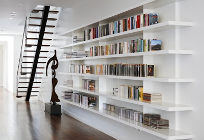
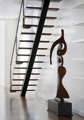
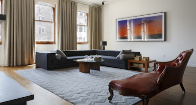
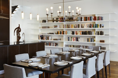
As most of you already know, Soho is short for “South Houston” and refers to a small neighborhood located South of Manhattan. This complex apartment design seems to counterweight the crazy and chaotic lifestyle of this particular USA region. The flat features an interesting terrace of impressive dimensions, a place of relaxation and promising outdoor parties. Interiors are airy and spacious. The living-room houses an interesting white bookcase and a dining area. Original looking wooden stairs connect the flat with the upper terrace, a symbol of living life “in the big city”

Apartment Interior DesignComplex Apartment Interior Design in Soho
Apartment Interior DesignComplex Apartment Interior Design

Living room minimalist interior design ideas

TIPsy Tuesday - Recoloring Brads

To create some graduation cards for my Operation Write Home cards, I thought it would be cute to make my own little graduation cap.  The center really needed a black brad and I didn't have one.  When you live over 15 miles from the nearest craft store, you learn to make do if you want to get done.  So I recolored a pastel colored brad.  Here's how:

  1. Thorougly ink a smooth brad in pigment ink of the desired color. (Stampin' Up!'s Craft ink is a pigment ink.)  I used black Colorbox pigment ink for my example. 


  2. Dip the inked brad in clear embossing powder and heat.  Be sure to hold the brad with tweezors to protect your fingers.
  3. Repeat this process if necessary to get a full coating. 
That's it!  A very simple way to give your brads a dye job.  I did find that Colorbox pigment ink did a better job than Stampin' Up!  I'd love to hear your experiences with inks.


Project Notes:
  • This is one of the few pattern papers I had with black in it and forunately it is two sided.  I used a strip of the stripe for the center and turned the paper over for the aqua color.  I didn't have any cardstock that matched this paper.
  • The morterboard is simply a 2" square of black cardstock with a hole punched in the center for the brad.  I attached it with dimensionals.
  • The tassels is made from DMC embroidery floss and adhered to the card with a glue dot.


Thanks for stopping by for Tipsy Tuesday!

Ingredients:  Designer Paper from Two Bugs in a Rug
Stamps:  Congrats from SU!
Ink:  Black pigment ink from colorbox, Basic Black for greeting from SU!

Monday, March 29, 2010

Best Home Design series of Modern Room Flooring at a Penthouse

wood flooring for modern living room design
Wood flooring is one of the best flooring design, here is the sample of the use of wood material on flooring, cabinetry, kitchen cabinet, and another storage system of this penthouse unit. This beautiful penthouse is located in Boston, Just enjoy and see these beautiful home furnishing and it's wooden flooring.
wood flooring for modern kitchen design


wood flooring for modern bedroom design


wood flooring and cabinetry for modern room design


wood flooring for modern room design

Pieced Dahlia


I'm trying to get an Operation Write Home box out of here today.  I wanted to include just a few more Mother's Day cards so I did these really fast last night.

One project note:  The flower is a series of graduated scalloped circles from the Accent Essentials cartridge on the Cricut.  I just alternated the colors and how they were turned to create the flowers. 

Thanks for visiting.  Tomorrow's TIPsy Tuesday is on recoloring brads.

Ingredients:  Stamps:  All Holidays from SU!
Ink:  Chesnut Roan from Colorbox
DSP:  Basic Grey's Nook and Pantry 6x6 paper pad.

Saturday, March 27, 2010

The reasons Why


One of the reasons I love this hobby of papercrafting is no one knows what you really intended to do.  This layout is a great example.  I started out with this cool circle paper from American Crafts.  I loved the colors and they fit my photos.  I knew I wanted to create a shopping bag and have my photos spilling out of it on tags.  Yet the paper was just too busy as a background so I started cutting and cutting... and cutting.  The short version is I was left with too short an amount of the paper to even get a border going all the way across the page!  That's when I improvised the idea of splitting the border with the circle element.   It's still a busy page, but no one really saw it the way it was before as I was assembling it.  If I hadn't told you, you would never know the border being in two pieces was really a way to fix a big mistake.  This just proves...


There really are no mistakes in papercrafting - just opportunities to be even more creative.  And thus this page kicks off a series of posts - about one a week - on all the joys of papercrafting.  You know them; I know them, but sometimes it is nice to see them in print.  So when someone (like your Mother or your husband) wonders why you can spend an hour in the scrapbooking section of Hobby Lobby or can't wait for the next card making video or just hole up in your craft room, you'll have a few ready answers. 

Notes for this Project 365 Layout:
  • As I've already confessed, I had to stretch the designer paper to get this border by cutting it and adding the circle element.  The center is a chipboard circle I painted with various shades of yellow and orange until I got something that worked.  I used Creative Memories circle cutters to cut the edges of the DSP around the circle element.
  • American Crafts DSP has a solid back that coordinates and it was a great blessing to this layout for the background and some of the elements.
  • The tags were cut with the Cricut and Tags, Bags, Boxes and More cartridge.  I printed the photos on matte paper and then pasted them on the tags.
  • The Kraft bag is cut with decorative scissors along the top edge and then just scored and folded.  It has 1/4" deep sides.  The handle is cut from a real shopping bag.
  • The 'tissue' is scrap cardstock.  I soaked each piece in water briefly, crumpled them up wet in my hands and then laid flat to dry.  None of these papers had an ink run but I've had that happen before so be careful of handling wet paper or you can end up with a lot of dye on your hands.
  • Another fix for this page was the yellow strip at the top.  I got the whole thing a little too high on the page so I just cut off some of the bottom and added a contrasting strip to the top.


In taking these photos for a week of Project 365, I was amazed that even when we shop in stores we often start on-line such as the Liberty of London bowls I bought at Target.  Target is a bit of drive for me so I wanted to know they had them before I bothered.  The Internet has changed many, many things but definitely the way we make purchases - and very much for the better.

Ingredients:  Designer Paper:  Everyday collection by American Crafts
Cardstock: Kraft and Choc Chip by SU!
Pens:  Signo White gel pen and journaling marker from SU!

Beautiful Contemporary House with Hydroponic Rooftop Garden


This villa is designed by Enric Ruiz-Geli’s firm Cloud9. It is an example of usual contemporary structure made of concrete but with a quite intriguing shape and very usual features that changes its look entirely. The most cool feature is that the building itself is the extension of the site. It is conceived as a growing C-shaped spiral with grass and plants on the roof. Besides hydroponic rooftop garden there is an underground garage so the structure is very economical and environmental. There is a lot of glazing in the house and its rear features an almost 50 foot-wide expanse of glass. Being environmental by itself the house also features the landscape views from many rooms.{via}


Friday, March 26, 2010

Painting

Painting & More Interior Room Painting
 
buy computer from DirectPC

 
 The Painting & More 5 Steps to Success

 
CUSTOMER CONVIEANCE AND JOB-SITE PREPARATION
  • Meeting with customer to arrange scheduling for rooms and areas to be painted.
  • Large pieces of furniture are moved into the center of the room.
  • Furniture is covered with tarp or plastic.
  • Drop cloths are placed to cover floors.
 
 
SURFACE PREPARATION
  • Walls are scuff-sanded as needed.
  • Holes and cracks in walls are repaired.
  • Any gaps in trim are caulked.
  • Any stains (water marks, etc.) are sealed.
  • Washing is done as required.
 
INTERIOR PAINT
  • Prime coat as needed.
  • Depending on surface, paint is applied with a brush, roller or sprayer.
  • Surfaces are painted to appropriate cover and finish color.
  • Clean lines between walls and trim.
  • High quality paints are used and touch-up paint is left with customer.
 
 
CLEAN-UP
  • Trash, etc. is removed.
  • Furniture is moved back into position
  • Floors and carpets are swept and vacuumed.
 
FINISH
  • Walk-around inspection is done with crew and customer.
  • Final "punch list" is developed and completed.

Good Living room

Decorating with Color

Many, if not most, people are afraid to use color in their decorating scheme. It feels safer to stick with neutral colors. But… If you want to be brave with color, rugs are a great place to experiment. Why? Area rugs are not a permanent fixture. Unlike walls, wall-to-wall carpeting or tile, you can move rugs from room to room if you wish. Also, the color pops from underneath and is more subtle than a brightly painted wall. For example, a predominately red area rug is not as dramatic as painting all four walls red. A vibrant rug color can be an excellent complement to your interior paint color scheme.
Decorating With Color
When making the decision to purchase a rug, check with the company’s return and exchange policy. Many times you can order small size rugs to reduce your risk. Purchase the smallest size available and if you like it, you can then exchange it for a bigger size. Order two or three rugs at time to compare and contrast. Be cautious however. The small, delicate pattern on a 2x3 rug may grow in proportion with an 8x10 area rug. Also, the background colors may appear much stronger on a 9x12 carpet than they were on a 2x3 mat.
Use color to create optical illusions and make rooms seem larger or smaller. If you have a massive room with high ceilings, choose a darker color scheme. This will make the room seem smaller and cozier. Conversely, if you have a very small room, choose light or pastel colors to make the room seem more spacious.
If the rug will be placed in a high traffic area, such as in a hallway, entryway or living room, it is best to use mid to darker tones to hide traffic patterns.